Are you an Andy Warhol fan? His designs include bright colors, repetition, and unique creativity. Make your own Pop Art name in complementary colors!
1.
Study a color wheel. Notice that contrasting colors are directly opposite each other on this intriguing art tool. Then look at various works by Andy Warhol. Discuss his Pop Art technique of using bold complementary colors and repetition.
2.
Divide your paper into at least nine equal sections using Crayola® Colored Pencils. Write your name or initials in each section using block letters.
3.
Cover your work area with recycled newspaper. Look at the color wheel and choose two complementary colors of Crayola Washable Paint. With a Crayola Paint Brush, paint the first one, and then every other name or initial, in one color of paint. Dry.
4.
Use the second complementary color to fill in the names or initials that are left. Dry.
5.
Use complementary colors to fill in the backgrounds of each section. Dry. Compare the visual effects of your classmates' Pop Art.
Explore Prince Edward Island with Anne of Green Gables! Draw and describe this enchanting Canadian island in an accordio
Students go wild filling Beasty Books and their brains with fun facts and figures about their favorite creatures.
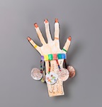
Native people living on the Great Plains depended on buffalo for survival. Discover many uses for their hides—and other
Balloons are both colorful and mysterious. What a perfect match for a challenging matching game of Concentration!
Write your own acrostic poems! With Crayola Dry-Erase Markers, it’s easy to make them colorful.
What a charming way to write a book report! Each illustrated bracelet charm captures a character, an event in the plot,
Picture yourself growing right along with your favorite fruits and veggies! Get to know classmates better and showcase p
Graphically illustrate blossoming literacy skills with a wrap-around-the-room vocabulary word display.