Calling all scientists! Record your findings with a colorful bar graph. Illustrate two sets of data or variables with amazing Crayola® Color Switchers™ technology.
1.
Bar graphs are a great way to visually represent growth or change. The basic parts of a bar graph are a section that shows measurement (height or weight for example) and a section that shows the passage of time or some similar factor. For instance, if you wanted to make a bar graph that showed how much you grew in the last year, you might plot your height in inches or centimeters (measurement) against months (time).
2.
What information would you like to show on a chart? Maybe you’d like to see how much your class hamster eats each day of the week. You first need to gather information. Let’s imagine that you feed your hamster in teaspoons, which is your measurement.
3.
Use Crayola Color Switchers Markers to draw a grid on paper. You need one column for each day, plus an extra column for your measurements. For one week, then, you need eight columns.
4.
What is a reasonable measurement of the amount of food your hamster might eat? If it ranges between one and five teaspoons, you need five rows for the food, plus a sixth row to write the days of the week. All together, you need eight columns (vertical), and six rows (horizontal). Use a straight edge to draw these lines on your paper.
5.
In each section on the left-hand column, list the number of possible teaspoons of food (measurement), with the least possible amount at the bottom of the column. Leave the top space open.
6.
On the top row, skip the first space, then write the days of the week, one in each space.
7.
Use your Color Switchers Markers to color each day’s column. Use a different color for each day.
8.
Now you’re ready to fill in your graph. If your hamster eats one teaspoon of food on Monday, flip the marker and apply the special color switcher to put a dot at the one-teaspoon level in the Monday column. If she’s particularly hungry on Tuesday, and eat
9.
Use a Color Switchers Marker to connect the dots from day to day. You can easily see if your hamster ate more, less, or the same amount all week.
10.
What else could you graph? If you are trying to improve your grades in a subject at school, you could graph each test grade against the number of the test, to see if you are improving. If you are growing tomatoes for a science fair project, you could meas
Calling all scientists! Record your findings with a colorful bar graph. Illustrate two sets of data or variables with am
How much is a liter? Make a mental switch to metric by pouring, measuring, and creating a handy chart to compare volumes
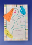
Learning how to add two or more numbers? This appealing, child-made board game integrates, math, science, and the visual
Become a body ruler! Measure ears, arms, legs, or feet to gain a familiarity with metric lengths. Chart your findings in
Be prepared! Design your own metric conversion chart to keep in your binder for quick reference.
How many students would it take to give your school a metric hug? Work together to measure the building’s perimeter and
These Earth-friendly robots engage scientific imaginations, creativity, and math skills. How will your Shaper Paper™ rob
Use imagination and problem-solving skills to build a model of a dream playground, taking into special consideration kid